I mean really.
It’s no surprise that MySpace has the most unbelievably retarded banner ads. At first they started off normally, tricking dumb fools into clicking on them by having a big red button that makes the ad look like a video game. Press the button to kick! Press the button to shoot the clown! Yeah, that makes sense, but then they became ungrounded, and banner ads were inviting rubes to click the button to roll, or drink, or sleep, or do a pull-up. How do I click a button to continue sleeping? The ‘games’ theme had become so abstract that the button no longer made sense.

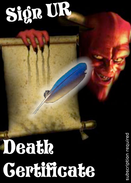
Meanwhile another genus of ads began to appear, the ‘spooky’ ads, which warned you to NOT CLICK HERE if you were easily scared, accompanied by faces of creepy stock photo children. Then they began to focus on speculating on what date you’ll die — because what could be scarier, right? Then somehow, the two merged, and now there are ads inviting you into some kind of death game, all I have to do is sign up:

No chance to win an Xbox. No free ringtones. No products, no service. No company is being advertised. I’m not signing my soul away in exchange for some prize, I’m simply acknowledging that I’m dead. Unless this banner ad was placed by satan himself (which I can’t completely rule out), what could possibly be the appeal of this gigantic, full page ad?
As if an ad inviting me to kill myself wasn’t bad enough, there’s a catch:

Subscription to what?!
You know, if it meant never having to see another incomprehensible flash ad, I would sign my own death certificate.
Ohhhh…. NOW I get it.